
I’ve been exercising my painting skills and trying to find a good way to get the best coat of paint on my model. The decks are still a difficult subject for me. I really do not like real wooden decks and most techniques whereby batches of individual planks are airbrushed in seem a bit harsh in contrast and I want to be able to paint in detail and repair work in later. Let’s have a look at decks first.
This image of HMS King George V shows the deck from a good distance and a lot of contrast is visible. This deck certainly isn’t a single monotonous area. Note that this deck is only a few years old but already looks quite ‘rough’.
The decks of MS Queen Elizabeth are a few decades older. Individual planks are visible by the contrast lines between them but the color differences between planks are slight. Note the wear and tear and dirt the deck collected. Again, far from a monotonous area and a lot is happening, color wise.
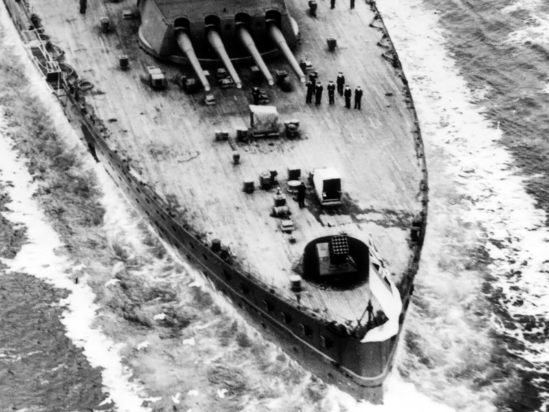
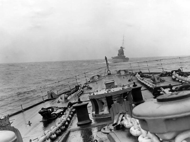
This close-up of HMS Rodney shows the deck up much closer than you would inspecting a model. It’s not really as if each plank has its own color but contrast shifts along the plank.
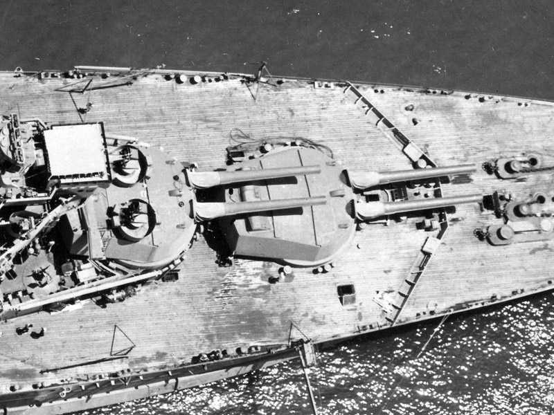
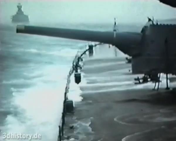
This nice photograph of the quarterdeck of HMS Rodney again shows there is quite some variation between the individual planks and that the color changes at the butt-ends of the planks that is sometimes very well visible.
When the ship is at sea and the decks are wetted, the contrast difference is more or less gone and the decks become nearly a single area.
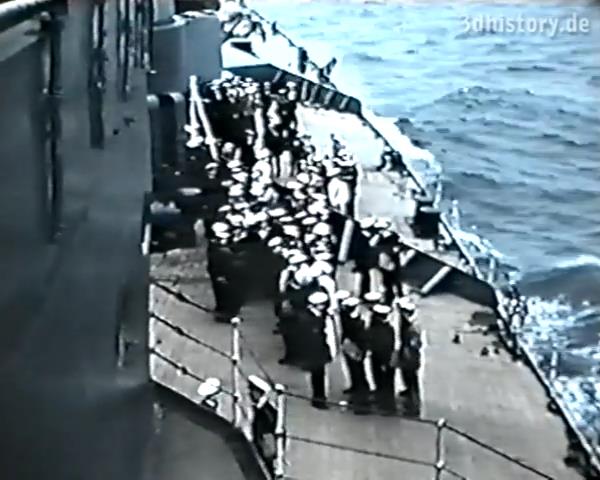
Some color footage of HMS Hood exists and Thomas Schmidt of 3Dhistory was kind enough to put in on youtube. I pulled a few frames from the clip. Now, the resolution isn’t as good as for the B&W photographs and interpreting color from old footage is risky, but you can still get some idea. The blue hue of the ship matches well with what I think AP507B should look like (I really don’t know!). Some variation between planks is visible but it is a sandy light brown overall.
The view of the aft deck shows the deck to be a grayish sandy brown tint without much variation.
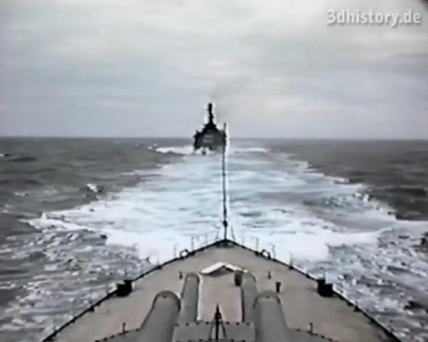
Again, during heavy seas the entire deck becomes more muddled.
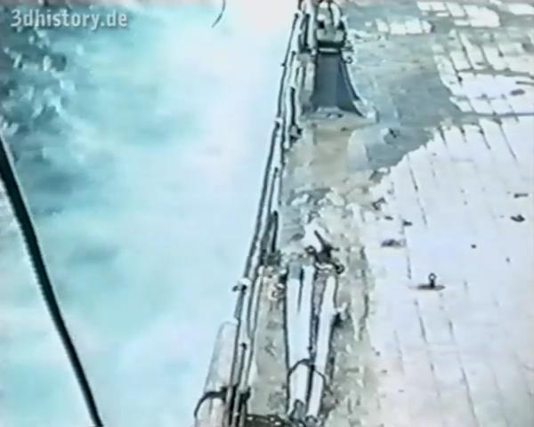
At the edges differences in reflection due to the green water and possible wear tear are present.
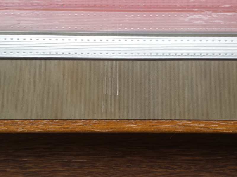
So for attempt N I started by spraying some Humbrol 72 on Evergreen grooved styrene and added color and accents at different locations. Painting in individual planks using white oils looks awful. I applied thinned-down Humbrol 72 in pure, whitened and darkened (Van Dyk brown) variations and blended everything together. Applying and blending in spots works nice and I think I have a decent attempt to have some large-scale color structure but nothing on the planks yet. A few washes of Van Dyk brown to add details to the groves was added afterwards.
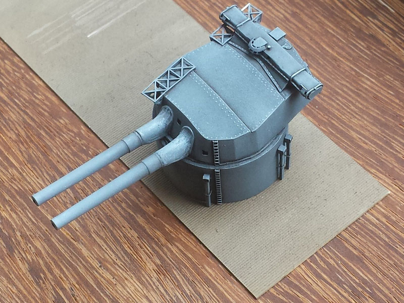
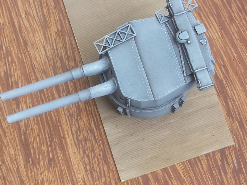
For some reason there was a lot of dust on the styrene test plate working itself in the paint; need to avoid that. The contrast with the turret is nice but the color variations do not really work from this angle. Need to practice more. However, I am really satisfied how well the turrets have worked out and feel pretty comfortable painting the entire superstructure; how this was painted will be treated in more detail separately (a part of the turret is still unpainted).
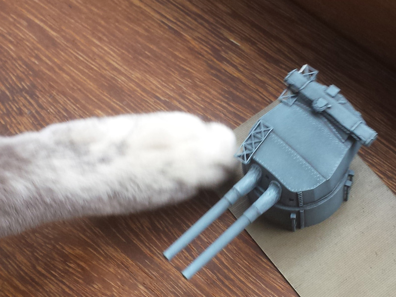
Cat attack! This not-quite-so-rare-moment was caught on film! Disaster is narrowly avoided.
Perhaps add spots of white and brown and blend them into the decks? It results in some variation but looks a bit… rough… and silly. More practicing is required, I’m not happy with the results so far… overall color is fine though.